.svg)

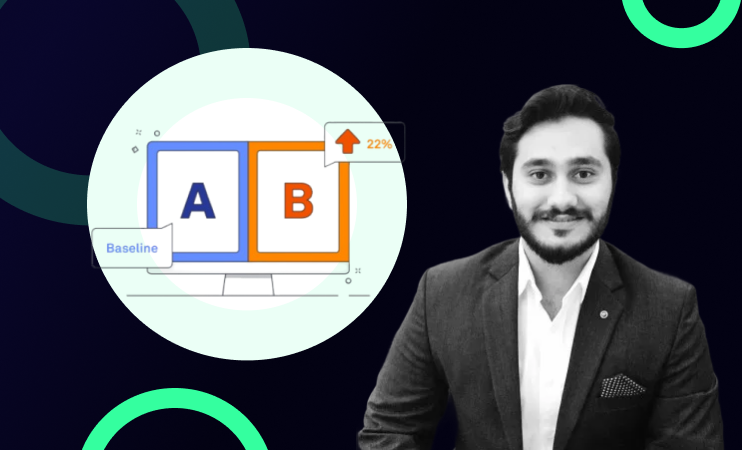
Most experimentation teams have more hypotheses than they can ever test. The bottleneck is not ideas, it is deciding which ones to run first. A structured prioritisation framework removes subjectivity from that decision and replaces gut feel with a scoring system grounded in data. This guide covers the most effective A/B test hypothesis prioritisation frameworks, how ICE scoring works in practice, where it breaks down, and how AI is now being used to make prioritisation faster and more objective.
Watch the full live demo of the AI-powered prioritisation workflow
Every product and growth team running experiments faces the same problem.
The hypothesis backlog is full. There are landing page tests, onboarding flow tests, checkout optimisations, email sequence variants, pricing page experiments. All of them have a case to be made. All of them have someone in the room who believes in them.
The question is never "what should we test?" The question is always "what should we test first?" And without a structured framework for answering that question, the answer defaults to whoever argues most convincingly in the prioritisation meeting.
That is an expensive way to run an experimentation programme.
Why Prioritisation Frameworks Matter
Choosing the wrong experiment to run first has a real cost. Engineering time building a variant. Design time creating the assets. Two to four weeks of experiment runtime. The opportunity cost of every other test that did not run during that period.
If you are running four experiments per month and your prioritisation is based on gut feel, you are systematically underinvesting in the tests that would have produced the most impact and overinvesting in the ones that were most enthusiastically argued for. Over a quarter, that adds up to a significant amount of wasted experimentation capacity.
A prioritisation framework does not guarantee you pick the right test. It gives every hypothesis a fair, consistent evaluation based on the same criteria, so the best-evidenced, highest-impact tests rise to the top regardless of who proposed them.
The ICE Framework Explained
ICE is the most widely used hypothesis prioritisation framework in experimentation. It scores every hypothesis on three dimensions, each rated from 1 to 10, and multiplies them together to produce a priority score.
Impact measures how large the improvement could be if the hypothesis is correct. A test targeting a step where 40% of users drop off has higher impact potential than a test targeting a step where 5% drop off. Impact should be grounded in your actual funnel data, not an estimate based on how exciting the idea feels.
Confidence measures how certain you are that the hypothesis will produce a positive result. A hypothesis backed by session replay data showing specific friction, analytics confirming a persistent drop-off, and customer feedback mentioning the same issue has high confidence. A hypothesis based on a single data point or a team member's intuition has low confidence. Evidence quality is what determines confidence, not how much you believe in the idea.
Ease measures how simple the test is to implement given your current engineering and design resources. A copy change on a landing page is high ease. A restructured checkout flow with backend logic changes is low ease. Ease should reflect your actual implementation history -- how long similar changes have taken in the past -- not an optimistic estimate made in a planning meeting.
Multiply the three scores together. The highest-scoring hypotheses go to the top of your experiment roadmap.
Where ICE Breaks Down
ICE is a sound framework. But in practice it has a consistent failure mode: the scores are subjective.
When a product manager scores a hypothesis at 8 for Impact because they believe strongly in it, and an engineer scores the same hypothesis at 4 because the implementation is more complex than it looks, the resulting ICE score reflects the team's opinions about the hypothesis -- not the data.
This is the prioritisation problem that manual experimentation programmes consistently encounter. Everyone uses a framework. The framework scores reflect whoever fills in the spreadsheet. The highest-priority tests still end up being the ones the most senior person in the room advocated for.
There are three specific patterns that undermine ICE scoring in practice.
Confidence inflation. Teams consistently overestimate confidence because they conflate belief in an idea with evidence for it. A hypothesis feels credible, so it gets scored 8 on confidence, even though the only supporting evidence is a single session replay clip.
Impact anchoring. The first Impact score set in a scoring session becomes the implicit benchmark for everything that follows. Later hypotheses get scored relative to the first one rather than against an objective standard.
Ease optimism. Engineering estimates made in planning meetings are almost always optimistic. Ease scores based on those estimates overstate how quickly tests can actually be built and launched.
How AI Fixes Subjective ICE Scoring
The workflow described in Webinar 04 addresses the subjectivity problem directly by running two independent scoring processes in parallel like one human, one AI, and using the differences between them as a diagnostic tool.
The human scores first, without seeing the AI scores. This is deliberate. If the AI scores first, it creates an anchoring effect, as humans unconsciously adjust their scores toward whatever Claude suggested. The human scores need to reflect genuine team judgment before any AI input enters the picture.
Claude then scores the same hypotheses independently, using a custom rubric built from your actual product data. For Impact, it looks at the reach of the surface being tested (how many users encounter this step), the expected lift grounded in historical funnel data, and the metric tier (direct revenue metrics score higher than proxy metrics). For Confidence, it looks at evidence quality, session replay evidence scores higher than a single customer complaint, sustained analytics trends score higher than one-week noise. For Ease, it references your actual implementation history, how long similar changes have taken in the past.
The output is two sets of scores sitting side by side in Airtable with a difference column showing the delta on each dimension. Where scores are aligned, prioritisation is straightforward. Where scores diverge significantly, the divergence is the signal.
A hypothesis where the human scored Confidence at 8 and Claude scored it at 3 is a hypothesis worth discussing. Either the human has context Claude does not have -- in which case that context should be documented, or the human is overestimating confidence based on belief rather than evidence. Either way, the conversation is more productive than it would have been without the independent scoring.
The Unlock Paragraph
One of the most useful outputs of the AI scoring workflow is what Zain calls the "unlock paragraph", a plain-English explanation of exactly what evidence would need to change for each score to move.
For a hypothesis scored at 4 on Confidence, the unlock paragraph might read: "Confidence would increase to 7 if we had session replay evidence from more than 20 sessions showing this specific friction point, or if analytics confirmed this drop-off has been sustained for more than 30 days rather than the current 7-day window."
This turns a score into an actionable research question. Instead of debating whether the hypothesis deserves a 4 or a 6, the team knows exactly what evidence they would need to gather to justify a higher confidence score. Sometimes gathering that evidence is worth doing before running the test. Sometimes it is not. Either way, the decision is explicit rather than implicit.
The Dual Scoring Process in Practice
The practical workflow looks like this. The hypothesis bank in Airtable contains every hypothesis generated by the proactive and reactive arms of the hypothesis generator workflow. New hypotheses arrive without scores. The prioritiser workflow (W1) is triggered, either manually before a weekly prioritisation meeting or automatically when new unscored hypotheses appear.
Claude pulls every hypothesis that still needs an AI score from Airtable. It reads the hypothesis statement, the evidence link, the page and funnel step, and the primary metric. It connects to Amplitude via MCP to verify the reach baseline and confirm whether the cited trend is sustained or a one-week anomaly. It then writes Impact, Confidence, and Ease scores with per-axis rationale bullets into the AI scoring columns.
The human team scores the same hypotheses independently in the human scoring columns. The delta columns populate automatically. In the prioritisation meeting, the team reviews any hypothesis with a significant delta on any dimension, typically defined as a difference of 3 or more points, and either updates the human score with additional context or notes that the AI score reflects something the team had not considered.
Hypotheses with aligned scores and high totals get selected for the experiment roadmap. Hypotheses with high human scores but low AI scores get examined, these are often where the most productive conversations happen.
Other Prioritisation Frameworks Worth Knowing
ICE is the most common framework but not the only one. Two alternatives are worth understanding.
PIE (Potential, Importance, Ease) is similar to ICE but replaces Confidence with Importance, weighting the business significance of the metric being tested rather than the certainty of the hypothesis. PIE tends to surface strategically important tests even when confidence is moderate. It is useful for teams that want to make sure their experimentation programme aligns with top-line business objectives.
PXL is a more structured framework developed by ConversionXL that uses yes/no questions rather than 1-10 scores to reduce subjectivity. Questions like "Is this above the fold?", "Does it address a known pain point from user research?", and "Has this been tested before?" each contribute a fixed number of points. PXL is more consistent than ICE but less flexible for teams with complex, varied hypothesis types.
In practice, the framework matters less than the discipline of using it consistently. A team that applies ICE rigorously every sprint will make better prioritisation decisions than a team that has a theoretically superior framework but applies it inconsistently.
The Human Checkpoint
The AI prioritisation workflow does not make the final call on what gets tested. It makes the conversation more productive.
Every hypothesis that reaches the experiment roadmap has been reviewed by a human. The AI scores surface disagreements and force explicit conversations about evidence quality and impact estimates. But the decision, this hypothesis ships as an experiment this sprint is always made by the team.
This is an important design principle of the system. AI amplifies the prioritisation process. It does not replace the judgment required to account for engineering capacity constraints, roadmap dependencies, business context, and strategic priorities that the AI does not have visibility into. The 8-step A/B testing framework makes this explicit, prioritisation is a human decision informed by data, not a data decision executed by AI.
Watch the full prioritisation workflow live
Zain demos the complete dual scoring workflow in Airtable including the AI rationale, the delta columns, and how the team uses divergence as a signal -- in the full webinar recording.
Want this system built for your experimentation programme?
If you want to replace gut-feel prioritisation with an AI-powered scoring workflow connected to your product data, book a free strategy session.
👉See the Experimentation Growth Engine
FAQ
What is the best framework for prioritising A/B test hypotheses?
ICE (Impact, Confidence, Ease) is the most widely used framework. Each dimension is scored 1-10 and multiplied together to produce a priority score. PIE (Potential, Importance, Ease) is a strong alternative for teams that want to weight business significance more heavily. PXL uses yes/no questions for more consistent scoring. The framework matters less than applying it consistently and grounding scores in data rather than opinion.
How does ICE scoring work in A/B testing?
ICE scores every hypothesis on Impact (how large the improvement could be), Confidence (how certain you are the hypothesis will produce a positive result based on evidence quality), and Ease (how simple the test is to implement). Each dimension is scored 1-10 and the three scores are multiplied together. Hypotheses with the highest scores go to the top of the experiment roadmap.
Why is ICE scoring subjective and how do you fix it?
ICE scores reflect whoever fills them in. Confidence inflation, impact anchoring, and ease optimism consistently distort scores toward hypotheses that are most enthusiastically advocated for rather than best evidenced. The fix is dual scoring -- having humans and AI score independently in parallel, then using the differences as a diagnostic tool to surface disagreements and force explicit conversations about evidence quality.
What is the difference between ICE and PIE frameworks?
ICE scores Impact, Confidence, and Ease. PIE scores Potential, Importance, and Ease. The key difference is Confidence versus Importance -- ICE weights how certain you are the hypothesis will work, PIE weights how strategically significant the metric being tested is. ICE is better for teams focused on evidence-driven prioritisation. PIE is better for teams that want to ensure experiments align with top-line business objectives even when confidence is moderate.
How do you use AI to prioritise A/B test hypotheses?
Connect Claude to your hypothesis database and analytics platform. Claude scores each hypothesis independently on Impact, Confidence, and Ease using your actual product data -- funnel reach, evidence quality, implementation history. Human scores are captured separately. The delta between human and AI scores surfaces disagreements that point to either missing context the AI does not have, or overconfident human scoring based on belief rather than evidence.
How many hypotheses should you have in your backlog?
Enough to always have the next three to five experiments ready to launch without scrambling, but not so many that the backlog becomes unmanageable. Most mature experimentation programmes maintain a rolling backlog of 20 to 50 scored hypotheses. The reactive hypothesis generation workflow -- where every completed experiment automatically generates new hypotheses -- keeps the backlog populated without requiring manual research sprints every cycle.