.svg)

4 Ways to Leverage High-Quality UX in Experimentation
The short version: UX experimentation used to mean isolated changes — move the button, swap the headline, wait for the conversion rate. Those tests still work, but as design and development get faster, simply producing more variants matters less. The bigger opportunity is upstream: think in experience multipliers (let each test inform the next), hypothesize experiences rather than buttons, treat visual design as a legitimate testable variable, and fix the biggest friction first. Done this way, you're not optimizing isolated screens — you're improving the experience as a system.
UX experimentation is changing.
For a long time, experimentation often meant making an isolated change: move the button, change the color, test a headline, and wait for the conversion rate.
Those tests can still work.
But as design, development, and experimentation become faster, simply producing more variants is becoming less valuable.
The bigger opportunity is moving upstream.
After spending a lot of time redesigning experiences and building variants for experimentation, we've found four things that make a real difference.
1. Think in experience multipliers
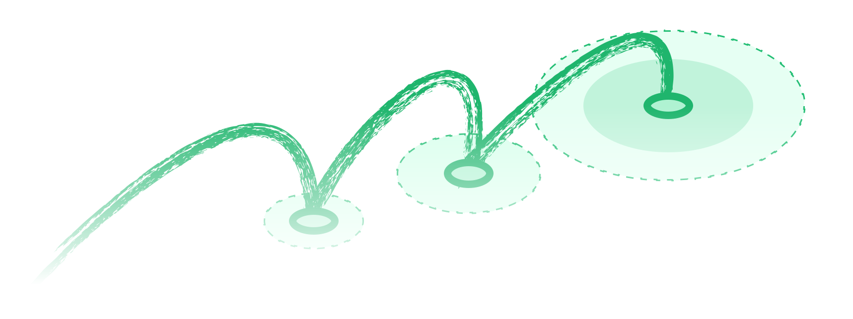
Don't design dozens of variants upfront just to have a large testing backlog. More variants don't necessarily mean better experimentation.
Instead, keep the hypothesis flexible enough to evolve as new experiment results change your understanding of the problem. Let the current experiment inform the next one.
Find friction → Form a hypothesis → Improve the experience → Measure → Learn → Apply the learning
The result of one experiment can change your understanding of user behavior and influence what you test next.
For example, imagine you're working on an ecommerce landing page and hypothesize that changing the hero section could help users understand the product more clearly. You create two hero variations: one focused on a personalized visual, another that provides more supporting information.
At the same time, you want to improve the next section, which explains the purchasing process. You create two variations there as well: one more structured and explanatory, another more visually driven.
Now you have four possible combinations.
You could test all four at once and find a winning combination. But that doesn't necessarily tell you which part of the experience created the improvement.
Instead, test the hero variations first. Once you understand which direction performs better, carry that learning forward and test the second section against the stronger hero experience.
This gives you a more controlled way to learn what is actually driving the result, while progressively building toward a stronger overall experience. You're not creating four variants just to have four variants.
You're using each experiment to narrow the possibilities and make the next experiment smarter.
By the end, you aren't just looking for a winning screen. You're building a stronger combination of experiences based on what you've learned along the way — which gives designers more time to develop better hypotheses instead of simply producing more variants.
Over time, you're not just optimizing isolated screens. You're improving the whole experience architecture of the product.
2. Hypothesize experiences, not buttons
.svg)
A button is easy to see. The problem behind the button usually isn't.
So instead of asking:
"What happens if we move the CTA?"
Ask:
"What is stopping the user from progressing?"
The hypothesis should be about the experience. It could be friction, motivation, comprehension, confidence, or the decision the user is trying to make.
Imagine users are reaching a product page but aren't moving toward purchase. There are dozens of things you could change: the CTA, product images, pricing, reviews, layout, copy, or page structure. But before changing any of them, we need to understand what might actually be holding the user back.
- Maybe the value isn't clear.
- Maybe important information is difficult to find.
- Maybe the user doesn't have enough confidence to make the decision.
- Maybe the experience asks for too much effort before providing enough information.
Each of these problems leads to a different hypothesis. This is why starting with the problem and the hypothesis matters — strong experimentation practice consistently recommends defining the problem and expected outcome before jumping into variations.
A button is a component. The experience is the system.
3. Data-led doesn't mean design-blind
.svg)
Experimentation naturally puts a lot of attention on measurable behavior. And it should. Conversion rate, completion rate, drop-off, engagement, and other behavioral metrics help us understand what is happening and whether a change actually made a difference.
But there's a risk when we treat everything that can't be immediately reduced to a number as secondary.
- Visual design can influence behavior too.
- Hierarchy affects what users notice.
- Typography affects readability.
- Spacing affects perceived complexity.
- Information architecture affects how easily users find what they need.
- Presentation can influence comprehension.
- Visual prominence can influence attention.
And all of these can contribute to whether someone feels confident enough to continue.
The point isn't: "Make it prettier and conversion will increase." That's not a hypothesis.
The point is: visual design is a legitimate experimentation variable when it has a clear connection to user behavior.
- If changing the hierarchy can help users understand an offer faster, that's worth testing.
- If restructuring information can reduce confusion, that's worth testing.
- If improving visual presentation can increase confidence at a critical decision point, that's worth testing.
Good visual design doesn't replace data. It works alongside it. Quantitative methods can tell us what is happening and measure impact at scale, while qualitative research helps us understand why users behave the way they do — often by watching where users get frustrated. Using both gives teams a stronger basis for deciding what to test.
Design isn't the opposite of data-driven experimentation. It can be one of the ways we create better hypotheses.
4. Fix the biggest friction first
.svg)
When a product is messy, the natural response is often to redesign everything. We don't think that's the best way to approach experimentation.
Start by finding where the journey is actually breaking.
Imagine a product with strong traffic, good engagement, and plenty of users reaching checkout — but a large percentage of them struggle to complete the purchase. In that situation, improving the hero section might make the website look and feel better. But it may not solve the most important problem. The higher-value opportunity could be the friction happening at checkout.
This doesn't mean always start at the bottom of the funnel. It means: find the biggest constraint first.
- Sometimes that constraint is at checkout.
- Sometimes it's product discovery.
- Sometimes users aren't progressing because they don't understand the value proposition.
The point is to identify the part of the journey that is limiting the outcome you're trying to improve — which usually starts with funnel analysis to see where the journey breaks. Once that critical constraint is addressed, you can move outward.
If a critical conversion point is still broken, improvements further up the journey may not translate into the outcome you're trying to improve. But once that foundation is stronger, improvements elsewhere have a better chance of contributing to the final result.
Fix the critical friction first. Then move outward. It multiplies the value of the experiments you do later.
Experimentation as a system
Experimentation isn't about producing more variants. It's about forming stronger hypotheses, measuring meaningful outcomes, and using the results to inform what you test next. When each experiment builds on what you've learned, you're not just optimizing individual screens. You're improving the experience as a system.
Put a stronger experimentation practice in place
Moving experimentation upstream: better hypotheses, design as a variable, fixing the biggest friction first — is as much about how your team operates as any single test. If you want to see where your experimentation practice stands today, our free Growth Gap Assessment scores your maturity across data, experimentation, and AI in about three minutes. And if you want help building this into how your team works, our Experimentation Programs are built for exactly that.
Frequently asked questions
What does it mean to move UX experimentation "upstream"?
It means shifting focus from producing lots of isolated variants (moving a button, changing a color) to forming stronger hypotheses about the underlying experience, and letting each experiment's result inform the next. Instead of optimizing single screens, you improve the experience as a connected system.
Should you test every variant combination at once?
Not usually. Testing every combination at once can find a winner but won't tell you which part of the experience drove the result. Testing sequentially — learning which direction wins, then carrying that forward — gives you a controlled way to understand what's actually working while building toward a stronger overall experience.
Can visual design be A/B tested?
Yes, when the design change has a clear connection to user behavior. Hierarchy, typography, spacing, and information architecture all influence comprehension and confidence, so changes that help users understand an offer faster or reduce confusion are legitimate, testable hypotheses — not just "making it prettier."
Where should you start when a product has lots of UX problems?
Fix the biggest constraint first. Identify the point in the journey that's most limiting your target outcome — often checkout, sometimes discovery or value comprehension — and address that before improving areas upstream. Fixing friction elsewhere rarely pays off if a critical conversion point is still broken.

.png)